In this sponsored post, author and business writer Jodi Torpey describes two freelancers’ plan to free the web from poorly written copy and design disasters.
Have you ever landed on a website that made you want to avert your eyes? Perhaps the white text on a dark background made it too difficult to read or the copy was so confusing you had trouble understanding the message.
No doubt we’ve all run across similar design disasters and responded by clicking on to another site.
Two no-nonsense freelancers have taken those affronts seriously and decided to do something about them.

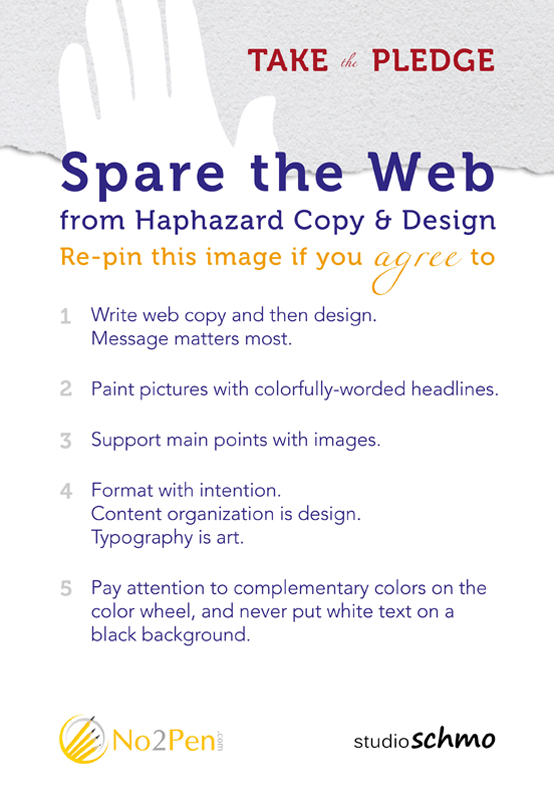
Sara Lancaster of No. 2 Pen and Anna Schmohe of Studio Schmo are asking others to take a pledge to Spare the Web from Haphazard Copy and Design.
“The campaign is about encouraging people to make their websites easy to read and navigate,” Lancaster says. “You don’t want your visitors getting lost on your site or leaving your site because of a few easy-to-remedy flaws.”
The pair wants to shine a spotlight on bad design by asking people to share their message and display the Spare the Web image with social media networks. By sharing the image, individuals show they’ve joined the effort to create quality web content and design.
“Let’s face it,” Schmohe says, “there are a lot of amazing websites out there, and a lot of terrible ones, too.” One of the main ideas behind the campaign is to provide a simple content and design road map that anyone can follow, she says.
The ‘Share the Web’ Rules
Website owners who take the Spare the Web pledge agree to live by five copy and design rules that promote best practices and address the duo’s website pet peeves. The rules:
- Copy should be written before a page is designed.
- Headlines matter.
- Main points should be supported with images.
- The right typography is essential. Select fonts that help communicate the message.
- The color wheel is an important tool.
When choosing headlines, aim for something description, Lancaster says. For example, instead of writing Welcome to the ABC Company Website, use What you Need to Know about Tree Trimming.
“In the second headline it’s clear what the company does and why you should keep reading,” she says. “The text conjures the image of a familiar object.”
Understand Your Brand
It’s important for a company to understand their brand and be consistent when selecting images for their website. “While you will have many images or graphics within one website, a consistent look and feel is important to branding and top-notch design,” Schmohe says.
Lancaster and Schmohe launched the Spare the Web campaign Oct. 17. Since then, they’ve been promoting it through blog posts, social media and email.
Anyone can take the pledge by displaying the image on their website or blog and sharing it with people in their online networks.
“Whether you pin, tweet or like the post or embed the image on your blog, you’ll be telling your followers that you are opposed to haphazard copy and design,” Lancaster says. “You’ll be telling the web that you are committed to making (it) a better place.”
Jodi Torpey is a Denver author, business writing trainer and writing coach. She’s on a mission to change the way writers think about their business writing — one reader at a time. She offers practical business writing tips on “The Daily Blatt” blog at www.WriteBetterFaster.com.
[This is post is written by a sponsor of WordCount: Freelancing in the Digital Age. The sponsor provides products or services to this blog.]

Thank you Jodi for featuring the campaign, and thank you Michelle for the real estate. So glad to get the word out about haphazard design and copy!
White text on black is at least more or less readable. I’ve seen all too many other combinations that are much harder–red on black, for instance, or red on green which for some people with impaired color vision can be completely invisible. And I’ve seen some shades of gray on white or dark gray that totally elude my failing vision.
For me it white on black is OK if the font is readable or big enough. I’m in the process of tweaking my website design and am deciding on a different color for hyperlinks: the green I’m using now is too light=not very readable.
Michelle Rafter