To do good writing, read good writing. Here’s the good writing I’ve been reading this week:
It takes a good storyteller to turn what what could be dry, boring statistics into interesting, sometimes riveting, stories.
Some journalists do it with words. But today, I’m saluting those graphics reporters who tell stories with charts and graphs.
The media industry uses different terms – infographics, charticles, data visualization – to describe turning statistics into visual presentations that help tell a story, presentations that are sometimes interactive, moving or changing depending on how a reader uses them.
I came across some great examples of graphical storytelling this week that I’d like to share. Hopefully it will inspire other freelancers so the next time you start working on an assignment, you’ll think about you can tell a story with words, photographs and numbers-based graphics.
Here are some examples of story telling through charts, graphs and other forms of data visualization:
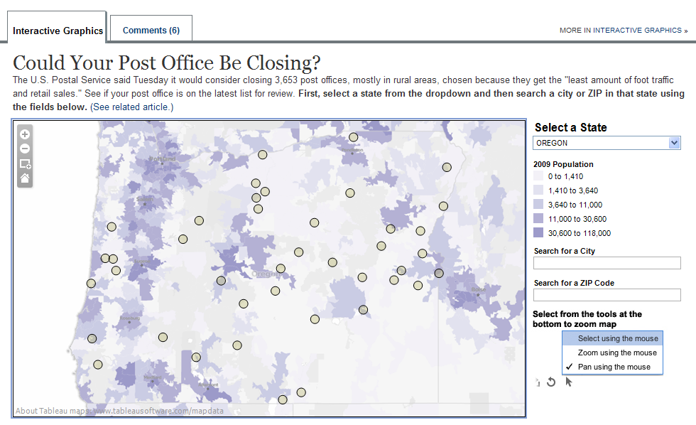
Could Your Post Office Close? – The Wall Street Journal routinely produces stellar interactive graphics. This one lets readers pick a state and then see which post offices the U.S. Postal Service is considering shutting down. State maps are color coded by population and zoomable. Hover your mouse over the grey bubbles and it brings up the city and Zip code of the endangered post office. (This and other images in this post are screen shots; click on the links to go to the live graphics.)
The Real Cost of Social Media – Look past the small type on this infographic about the ROI of social media programs on the Digital Buzz Blog, which tracks the interactive marketing industry. The graphics tell the story: running social media programs isn’t cheap, but the pay off can be huge. The dark and light blue colors are striking against the black background; bar charts do a good job of pointing out social media programs’ benefits, and the juxtaposition of bar and circle charts keeps readers’ interest.
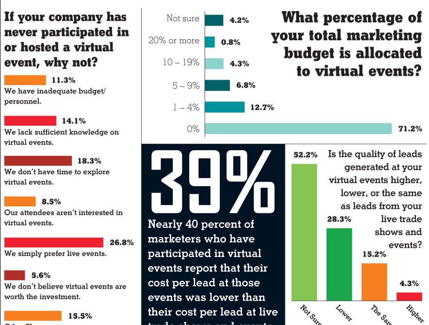
Virtual Reality – Bigger really is better, at least when it comes to graphics. EXHIBITOR Magazine, a trade magazine for the convention industry, demostrates this in a June 2011 story about virtual grade shows. The graphics are huge, with judicious use of strong primary colors balanced out by lots of black and white, with bold, serif fonts that demand that readers pay attention. I guess when you cover a visual industry, you gotta make sure you’re walking the walk, eh?
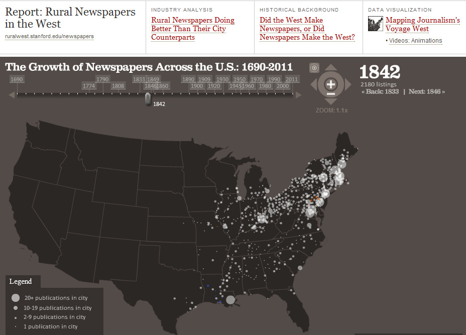
Journalism’s Voygage West – Not all information-based interactive graphics are created by journalists. Stanford University’s Rural West Initiative, for example, used interactive mapping tools to create a data visualization of the growth of U.S. newspapers as the country’s population spread west. As the reader slides a knob across a timeline that runs from 1690 to present day bubbles pop up in cities that had newspapers during the year associated with that date on the timeline. Larger bubbles indicate cities with multiple publications, and colors represent newspapers in various languages.
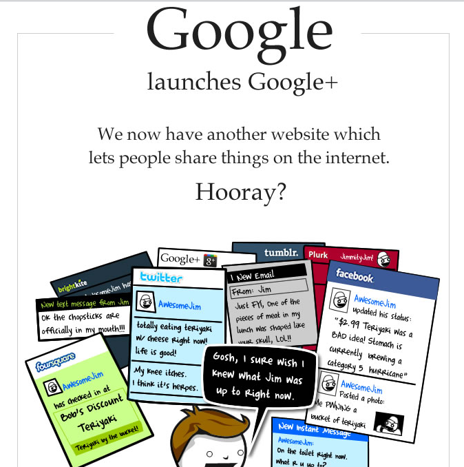
The State of the Web Summer 2011 – Not every story has to be serious. Exhibit A: The infographics produced by The Oatmeal – OK, they’re cartoons, but a lot more. They depict modern, plugged in life and are consistently spot on, including this one, which captures the zeitgeist of modern wireless life while lampooning it at the same time.
