If a writer is only as good as their brand, then it pays to make your brand look good.
Lately, I’ve invested more polishing my brand than at any other time in my freelance career. The expense alone is more than $800, not to mention the non-billable hours I’ve spent on the project.
First I hired writer-turned blog designer Ron Doyle to redo this blog. That went so well, I hired him again to create business cards, electronic letter head and a matching Twitter background image. More recently I hired Portland editorial photographer Amaren Colosi to take new head shots to go with my updated look.
Why bother? After all, I spend most of my days alone in front of a computer screen.
But there are a handful of legitimate reasons why a writer should have a brand, and a good-looking one at that.
1. If you call yourself a professional, you should look professional. It’s one more way to differentiate yourself from wanna-be writers in the eyes of editors and publishers who use blogs and Twitter to scope out potential contributors.
2. Matching isn’t great for bedroom furniture. But when it comes to promoting your work as a writer, there’s something to be said for presenting a cohesive look. Repeating the same designs, colors and logos on a blog, business card and Twitter background help drill into people’s heads there’s one and only one person behind all of it.
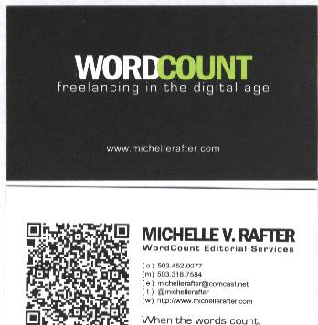
3. People still use business cards, even if it is to copy the information into their smartphone – which is why Ron suggested including a bar code on one side of mine (see below). The business cards I had before were cheap ones I’d had made shortly before taking a last-minute trip to visit editors in New York and didn’t reflect how my business has evolved since then.
4. Whether bold and beautiful, minimal, futuristic or retro, a brand is a short-hand way of telling the world something about you and the work you do. Ron and I chose the colors, fonts and proportions we did to create a look for WordCount that was authoritative and future-leaning, yet at the same time personable and welcoming.
5. It’s pretty and I like pretty.
See for yourself. I started with the logo for this blog:
Next, Ron came up with these business cards, complete with scannable bar code:
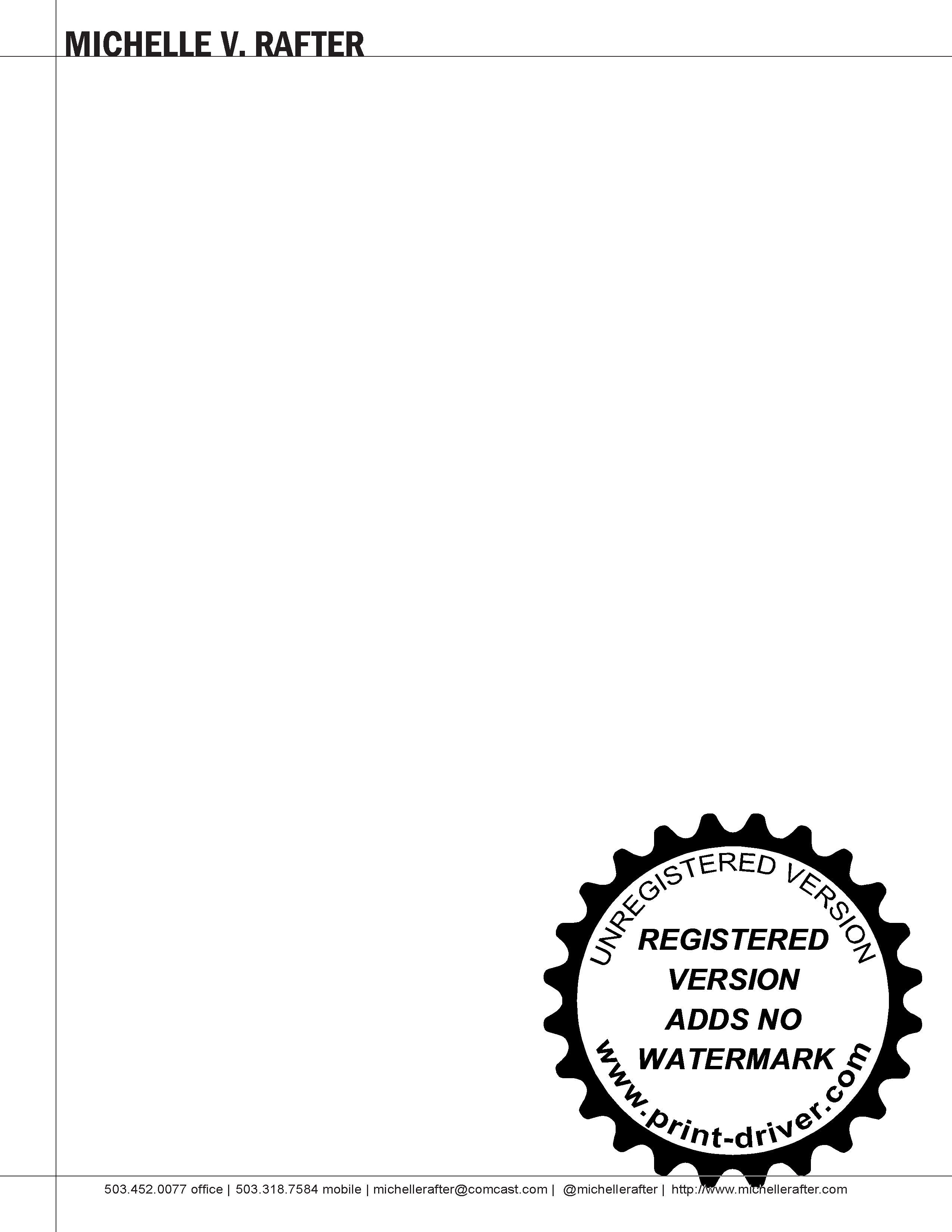
And then this electronic letterhead:
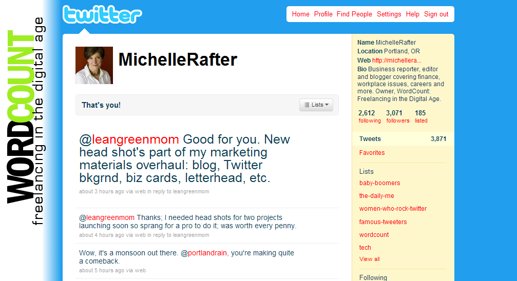
And finally, this Twitter background:
I call these elements my online brand. Doyle calls them a writer’s web portfolio, and he’s going to be teaching a class on how writers can create their own. He’s still working out the details, but follow him on Twitter and you’ll be sure to catch the announcement when the time comes.
What’s your brand? If you’ve got examples, feel free to share in the comments section – I’d love to see what other writers are doing.


Michelle, I love the new headshots and branding. Ron and Amaren did a great job. I’m curious what happens if you actually scan the barcode. Does anything cool happen like we discover your blood type and shoe size?
I need a better Twitter background, but I’m happy with my website, headshots, and blog template.
Susan: The bar code contains the same information you see on that side of my business card: my contact information, website, Twitter handle, etc.
Michelle
Very cool. Love the bar code! Wish I had an extra $800.
Thanks. Although it sounds like a lot of money, I didn’t spend it all at once. The first and biggest chunk was for domain names – I bought rights to 6 when I switched from WordPress.com to a self-hosted blog – and website design. A few months later I paid for the business card, letterhead and Twitter page. A month after that I got the new head shot. So you could definitely spread out the costs so it doesn’t hit your wallet so hard all at once.
Michelle